Ontario Honours & Awards
This is a usability research study I completed while working as a User Experience Designer for the Ontario Digital Service. Our role included narrowing the scope of testing, identifying user groups and related flows, recruiting participants for usability tests, conducting usability tests to improve the platform, and presenting our recommendations to the Ministry and client.
my role
user researcher + test facilitator
ux writer
final findings presentation
tools used
zoom
msft excel
figma
project context
2 Researchers
feb 2022
6 weeks
summary
I completed this project while working as a User Experience Designer for the Ontario Digital Service. We were tasked to Usability Test a portal that Ontarians use to apply to various awards provided by the provincial government. Our role included narrowing the scope of the testing, identifying relevant user groups and related flows, recruiting participants for usability tests, writing a facilitation guide, and running the usability tests to improve the platform. In short, this case study focuses specifically on my work conducting usability tests.
the process
Research Plan
Purpose
Methodology
Recruitment Procedure
Scenarios & Task List
Data Collection
Note Taking
Recorded Zoom Sessions
Task Success
Analysis
Graphing Quantitative Data
Affinity Diagram
Findings
Extracting Insights
Sorting Insights
Revisiting Raw Data
Client Presentation
introduction
17 different awards, with unique user groups
The Ministry of Heritage, Sport, Tourism and Culture Industries (MHSTCI) came to us to test the usability of a portal used to apply for 17 different awards. They also wanted to test the usability of a portal used to review applications for these awards. Each award had its own target user group and application process through an already developed online form.
Some of the target user groups for award application flows were broad (ex. general Ontario public) and some were very specific (ex. Parents of Indigenous teens). Given the diverse target audience for this platform and the short timeline for this project (one month), we started by narrowing the scope of the project.
narrowing scope
In order to narrow the scope of this project we had to start by understanding the extent of the prototype we had been given and what our clients expected from us by the end of engagement. Understanding the prototype included talking about how users were accessing the portal, who users are, what problems they have had with submitting applications in the past, how applications were submitted in the past and so on. All of this information came from talking to subject matter experts ahead of talking to actual users during the usability test. Our subject matter experts were the program administrators who ran all of the awards applications. They had experience reviewing applications, running the end to end awards program and helping applicants with any issues they come up against. The program experts were also the clients for this project. They helped us gain the solid background knowledge needed so that we could come up with questions that made sense during our usability test.
key takeaways
1.
Most users submitted applications online by filling out pdf forms - Meaning that they would expect the online form portal to behave similarly to web pdf (mental model transfer)
2.
Some users submitted forms through mail or by submitting a paper copy - Meaning most of the applicants were of a older age demographic (this type of statistical data about users was also provided by the client team)
3.
MHSTCI wanted two portals tested (application and review portals) and they wanted all 17 award flows tested within a month span - luckily, with a lot of deliberation we were able to narrow testing to just the application portal and a couple handful of flows
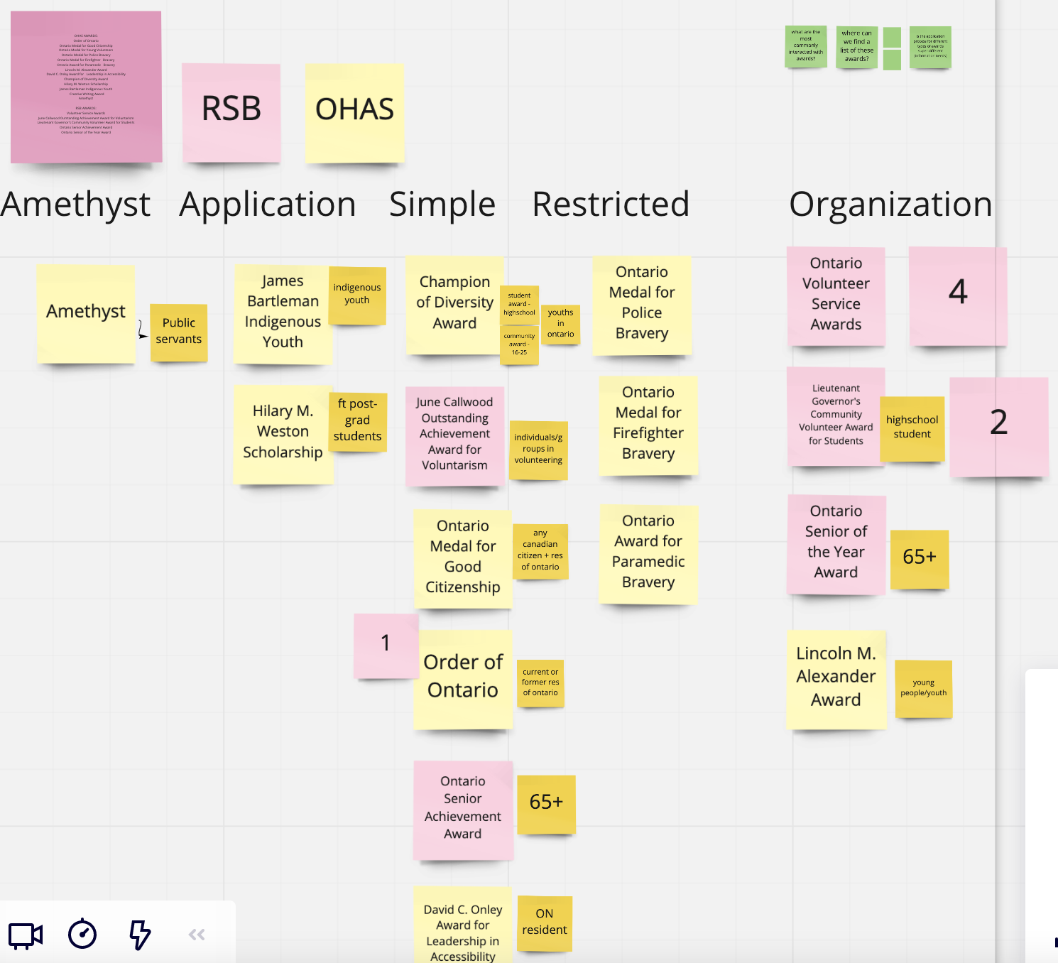
The Miro board used during project kickoff. We used this board to get an understanding of our clients ideas for the project.
Choosing our User Groups
To choose which flows to test, we consulted our subject matter experts and grouped the 17 awards into smaller segments. Our groupings were based on similarity or complexity in application flow, similarity in user groups and statistical data that identified most commonly applied for awards. We wanted to test with the least amount of awards but have a high impact.
We were able to narrow our research to focus on 7 flows for the listed reasons:
Order of Ontario - Had the largest set of recurring users
Lieutenant Governor - Had the most similarity to most of the other flows in terms of form components that were used repeatedly and was one of the most simple flows that could be tested
Volunteer Service Awards - Required users to submit on behalf of an organization (as opposed to submitting the application for self)
James Bartleman, Hillary M Weston, Bravery - Had very niche user groups (graduate students studying mental health, parents of Indigenous students, police/paramedics/firefighters), the flows for the application had niche content to be tested for usability, these were some of the more complex flows
Writing a Facilitation Guide
In order to write a facilitation guide to use while usability testing, we had to come to understand all of the flows we were going to test at a granular level. Our usability testing focused on end to end user experience of applying for an award though the portal. This means we looked at content, interactivity, accessibility and other important aspects of user interfaces that have an impact on UX.
We began by walking through and mapping all of the flows on Miro.
Then we broke down what made each flow special and added some notes about how to best test features of the application. For example, some flows had pages that could not be edited once information was inputted for the first time. We wanted to make sure this technical limitation of the system was communicated so that there was minimal negative implication on the user.
In our facilitation guide, we included a question that indirectly asked users whether they noticed they could not change the information once inputted. If the user did not verbally communicate that they noticed this aspect we asked them to tell us more about the information on this page before continuing on. This question was specifically designed to not be a leading question. Each testable award in the portal had its own facilitation guide.
Our guides also included flows outside of just applying for an award. We also looked at how users would navigate accessing help, whether the homepage made sense and how applications can be withdrawn or edited. These were universal to the facilitation guide for each flow.
Personas
Lastly, for this project we decided to create personas for usability test participants to emulate while going through the flow. Personas were provided to the participants before the usability test and contained filler information to be used while testing the forms. These were drafted along with the facilitation guide. (Fun Fact: Our user research plan including all the facilitation guides was 50 pages long!!)
Recruiting Participants
Recruitment for this project consisted of drafting recruitment materials, posting materials for outreach, and scheduling participants. We also made sure to have content such as consent emails for usability testing and scheduling emails ready to go.
We drafted materials for general social media, drafted tweet-length materials, and drafted email messaging. These channels were specifically chosen to reach the appropriate target audiences and to support outreach done by the client team. All outreach materials included a link to a screener that was designed to provide us with a solid understanding of target users prior to usability testing with them. We wanted to know whether potential testers had experience with the awards portal, how they learned about the portal, how often they have submitted in the past, and what user group they fell into. The screeners also included an optional set of demographic-related questions that were used to assess the diversity of the group tested. Lastly, the screener gave users the opportunity to disclose their availability for usability testing.
For each of our seven flows we wanted to have two to three testers each. There are a couple of rationales to this:
There were similar elements to all applications
Each guide had the same questions about flows outside from applying (help, editing etc.)
Differences in facilitation guides were related to user group specific content
Statistically you only need to usability test with 5 users to get significant data (Neilsan & Norman, 2000)
We were able to recruit 10 participants within the given time frame. These respondents were sent consent forms (consent to record and consent to participate) and were scheduled in for a usability test.
Running Tests
Prior to facilitating usability tests with actual users we were sure to schedule a dry run with a co-worker. This allowed us to make any final tweaks to the facilitation guide and get a little bit of practice in.
Our main focus while running the scheduled tests was to avoid asking leading questions and allow users to explore the page as much as possible. We did a lot of probing into why user decided to interact in certain ways. We also reminded users think out loud and be as open as possible with their answers. Notetaking for interviews was done on miro so that we could affinity diagram our notes afterward.
Synthesizing Findings
We synthesized our findings by affinity diagramming our notes and identifying common themes. Due to the tight timelines for this project, our clients requested that we organize findings by priority. Our last step was organizing findings by priority and creating a few prototypes for the findings that were harder to communicate textually. Our prototypes were made to follow the Ontario Design system (which I helped develop - case study pending).
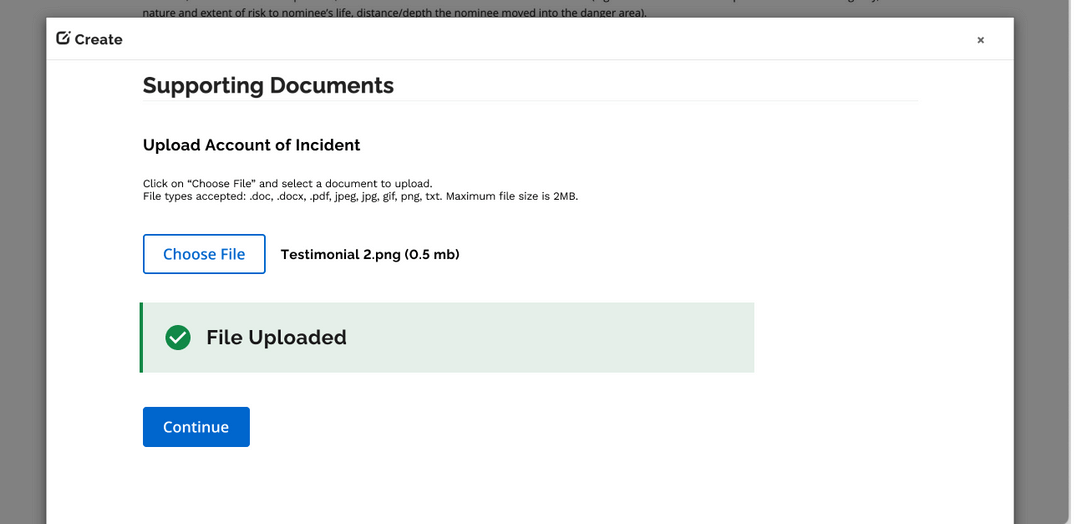
Some of our findings included improving feedback mechanisms and clarity around what had been uploaded and what could be uploaded. You can see that we used elements of Ontario's Design System like callout boxes to make it super clear when a file had been uploaded and the size of the file that was uploaded. We also improved the page by making the calls to action (buttons) more clear and findable.
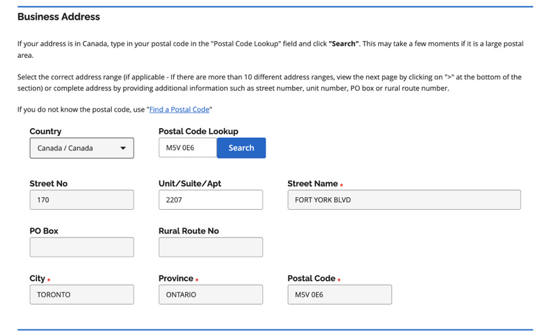
Another improvement had to do with adjusting the system's method of choosing an address. The default system of address input disabled some input boxes and had an unusual flow that required users to start by entering their postal code and searching. Our redesign made it clear what needed to be done first (search) and got rid of the greyed-out disabled input boxes that a lot of users found confusing during testing. Removing greyed-out fields was also done to alleviate accessibility issues.
Wrapping Up
We wrapped this project by presenting our findings to the project team. Here is some of the feedback we received from our partners through a post-engagement survey.
“Engagement was very professional and well executed”
“Thank you for all the hard work that was put into the testing phase of the new portal”
Lessons Learned
One lesson learned was that there are limitations to consider when your subject matter experts are also the clients for the project. For example, it might be difficult for them to separate their expertise from their idea of how the end product should be designed. One thing that helped with this was allowing the clients to shadow the usability tests we ran so that they could hear feedback firsthand
I also learned that it is very important to make sure your stakeholder understands the reasons behind all your recommendations even if they want findings to be presented in a different format. In this case findings were presented in order of priority so that high impact issues in the flow could be fixed first - I learned that in cases like this the reason behind the recommendations should be articulated as clearly as the recommendations themselves
Another thing I learned is that it is always super useful to test the most simple flow of an experience as well as testing the more complicated ones. Testing the most simple flow allows you to identify whether there are any hidden fundamental issues with a given flow that are not associated with complexity.
Last I learned something super interesting about using personas while usability testing. They are actually quite difficult to understand if not explained in depth. Users find it much easier to think about their own experience with an interface instead of trying to emulate someone through a persona. This is especially true when testing an interface that only a small niche of users will access


