Imprint - hackathon project
This Adobe x IBM iX hackathon challenge prompted us to identify a critical area of need regarding climate change and then conceive, design and build an experience that enables individual or group climate action that is accessible, achievable and measurable.
my role
project manager
user researcher
app re-design
tools used
figma/adobe xd
sketch
illustrator + photoshop
project context
5 team members
48 hours
the problem
Our climate is changing, fast. To avoid catastrophic consequences to our health, economy and the biodiversity of our planet, we need to take action. Efforts to create a sustainable climate for the planet can feel like a daunting and inaccessible goal at an individual level. What if there was a way to contribute in small meaningful ways that could deliver a large impact?
the design process

exploring the problem space
As students ourselves we started with considering what problems do we face when paying hydro & gas bills. Unsurprisingly we discovered none of us handled bills. But, did we know how to access our monthly energy consumption? No. This provided us with a path to focus on. We conducted a survey consisting of 67 users - majority of them were between the ages of 18-30.
We started with collecting data about people's experiences with bill payments, methods of accessing bill information and energy consumption awareness. Living situation is a key feature that affects every household's energy consumption monthly. These various questions were addressed in our survey.
Three areas were identified to test our users on:

energy bill payments

information accessibility

consumption awareness
our key user research survey insights showed…
82.8%
surveyed weren't the sole bill payer in their household.
62.3%
didn't know how to access their household's bills and energy consumption
92.5%
were highly interested in learning about their individual and community energy consumption
now how might we…
create
an inclusive product that provides it's users with an incentive to compete?
build
a system that promotes accessible information for its users?
provide
a platform for users to learn small effective ways to reduce their energy consumption?
our approach
Now that we had our demographic, user goals and insights explored from our primary research; we started with building our product. A sitemap was created with some basic user-flow points to identify where the main points of navigation should be placed. This helped eliminate any redundant pages optimizing the user experience.

sitemap


we created some user flows and user journey based off our sitemap to better understand the structure of our app. Here is where we identified some on-boarding & accessibility issues. This helped us form an efficient user experience.
ideation
After solidifying our ideas on the whiteboard we began to refine them through a greybox prototype. At this stage we wanted to make sure that the navigation was smooth and understandable for our users.

ideation
our style tile, overview of components and sketch file


our prototype + core features
After conducting research and deriving insights we had a better idea of what kind of user we were designing for. We decided that key things that should be displayed are: the data should be displayed in a user friendly manner where it is easy to understand, provide users with Information on how to reduce usage and save money and a way of providing users with an intrinsic of motivation for reducing their environmental impact.

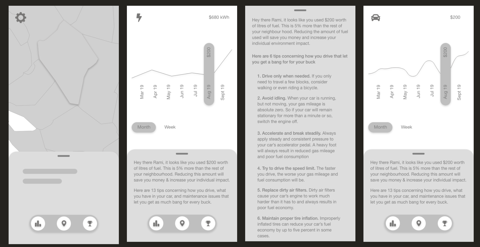
Tracking Usage
A pie chart was used to visualize the percentage really well because it’s divided up into different categories based on usage. Below the pie chart lie several cards that correlate to the category of the pie chart which shows users their total cost for the month. When clicked, each category will display its’ own graph giving the user a thorough analysis of their usage data.

Map and Leaderboard
We added a map feature to help users visually identify where they are. Each region comes associated with a certain rank based on their community’s performance. This provides users with a sense of competition to motivate themselves to do better than states that are ahead in the game. The leaderboard summarizes the map data allowing for quicker comparison of scores.