
Ontario’s Covid-19 Website
During the COVID-19 pandemic, my Ontario Digital Service prototyping team took on the challenge of rapidly designing what is now the COVID-19 Ontario website.
As a product designer, I was able to contribute to information architecture, visual and content design, and most importantly, facilitate user research with Ontarians across the province. I got to connect remotely to learn what people of Ontario care about during unprecedented times and use their feedback to drive the design for the website and COVID-19 data visualizations.
Visit Live Site
my role
user researcher + test facilitator
ux designer
final findings presentation
tools used
zoom
msft excel
figma
project context
ODS Lab team
UX Designers
Developers
“How might we create a COVID-19 digital resource that addresses the informational needs of Ontarians?”
Defining the Problem
When the lock down began, my team just finished wrapping up a previous project and were alerted on a problem impacting Ontarians that needed to be immediately addressed. People couldn’t find what they were looking for when it came to the provincial government direction regarding COVID-19. As a government entity, the public look to us to provide authoritative information on new regulations and support programs available.
As a way to discover what people were actually asking the Government of Ontario, I looked at our social media channels to see what questions people had during these pandemic times.

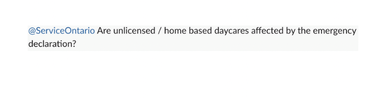
After viewing our current COVID-19 website, it became clear to me why people still had the questions they did.
What we were doing wrong:
❌ Too long and too text heavy, making it hard for the users to scan for relevant information
❌ Loaded with technical terms and government jargon. The data especially was presented in its scientific format that’s not accessible to the layperson
What we needed to do:
✓ Create a page that’s easy to scan and read, separated by topics the public cares about
✓ Show the data in a digestible way, something people can interpret at a glance
With these points, our team put together a problem statement that would guide us through our redesign challenge. Our key performance indicators would rely on the increase in page visit, page duration and click through rates.
the process

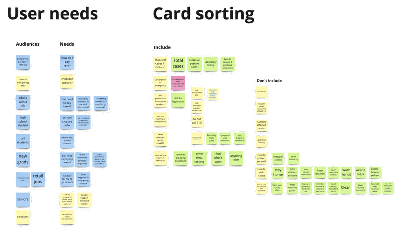
Information overload

Our first task was to break down the current site into its informational backbone. This would allow us to analyze the current structure and propose the new information architecture. We got to work on our miro board:

In addition to the questions from Ontarians on our socials, we looked at what other jurisdictions were doing when it came to presenting COVID-19 information. One thing that became quickly apparent to us was the fact that most jurisdictions had a separate micro-site for their COVID-19 related information. This allowed for a better organization of related material and a strategic way to direct traffic to a dedicated site.
It became apparent that for the long term sustainability of our COVID-19 communication and related digital services, Ontario should also have its own micro-site. With our product manager we devised a roadmap, contingent on approval from our stakeholder ministries, on how we can iterate the site design to meet our short and long term goals.
Rapidly Changing Prototypes
Our group took 5 minutes to quickly sketch redesigns of the initial information site and then dot voted on features we appreciated and would fit our user needs

click to view sketches in full screen
One feature I proposed was how to group our information. Since our target user group of Ontarians is vastly diverse, I wanted high level categories that would address our audiences and their general roles. I recognized that this was a divisive design choice and would ideally opt for more action based categorization, however it helped us organize the information quickly and was flagged as a feature to test and iterate.

The Miro board used during project kickoff. We used this board to get an understanding of our clients ideas for the project.
Micro-site iteration

From our sketches we moved over to figma to hone out our design. As soon as we finished creating our initial information site, we started to lay down the foundation of the COVID-19 micro-site design so we could pitch a tangible product and get the green light on our strategy. This method was successful in getting senior executive buy-in, they appreciated what they were seeing and we continued our work on developing the micro-site further.
Community Test
Once our initial COVID-19 website was launched, we quickly switched gears to user testing our microsite design so we could begin developing validated designs. Usability testing under lockdown was an interesting experience but thankfully our lab was well versed in remote user testing, since we try to make sure we are talking to people from all parts of Ontario.

Each point on the map represents the reach of our user research
We asked questions like:
“What information do you look for when it comes to COVID-19”
“What do you want the government to have on its COVID-19 website that would help you?”
“Questions around their initial impression, what they found useful, and the categorization of information and visualizations”
Most of the user feedback proved that we were on the right track with adjustments that would make the delivery better. The main comment we kept hearing over and over was around data visualizations. It wasn’t just a want for graphs and statistics about the virus though, Ontarians wanted to understand the data narration. This meant communicating in an accessible way how the province is doing in terms of hospitalization, flattening the curve and the potential future.
Visualizing the Virus
Trying to design effective data visualizations had me recalling and referencing material I learned during my data science courses. This helped me persuade our team for the use of bar and line charts compared to other graphs because of the mostly chronological dataset we were working with. I also proposed the idea of displaying COVID-19 cases by location through a map of the province as a way for users to quickly locate and understand the impact in their area.


We created a data mood board based on our competitive analysis. We sketched and dot voted our own ideas.
our process

The visualizations again went through rounds of user testing and we produced different versions both prototyped in figma and coded using the ApexCharts.js open source library.
click on image to view full screen in new tab
The main lesson from our users
📍 Communicate one message at a time. This helps with the mental load of understanding new information.
📍 Accessibility first. Don't rely solely on colours to communicate your data, use short descriptions that narrate the message.
Presenting The Unprecedented
During this time it was imperative for us to keep our extended team informed on our user findings. We held weekly Show and Tells highlighting user insights for our production team, making sure that our users’ needs were acknowledged even after hand off.

Slides communicating design recommendations to our extended team
This project went through an incredible amount of iterations in a small time span, a testament to our labs ability to truly prototype rapidly.

Slides communicating design recommendations to our extended team
It was also incredible to receive kudos from the teams we looked up to for inspiration.

Lessons Learned
As the production team continues to iterate on our initial designs and further actualize the microsite we helped ideate, I feel a lot of gratitude to have been involved in this experience. From hearing feedback from Ontarians across the province, I witnessed how effective design can help alleviate stress during one the most stressful periods of our lifetimes. I learned how to use my empathy as a designer, not in its passive state but as a motivator for accessible designs even in a time so unknown. As challenging as this experience was, it was an incredible growth opportunity that taught me how to lead with motivated empathy amidst the ambiguity.I also learned that it is very important to make sure your stakeholder understands the reasons behind all your recommendations even if they want findings to be presented in a different format. In this case findings were presented in order of priority so that high impact issues in the flow could be fixed first - I learned that in cases like this the reason behind the recommendations should be articulated as clearly as the recommendations themselves